Pricing
How much does a real estate agency website really cost?
July 27, 2026 · 8 min read

Every agency owner asks the same question before starting a redesign: how much is this actually going to cost me? And every quote page online answers with a range — €2,000 here, €8,000 there — without ever showing you what that money actually buys.
So here are the real numbers I've seen quoted across the market, and then a real example: the same agency's website, before and after a premium redesign. Not a mockup — an actual site I audited and rebuilt.
What the market actually charges
Based on pricing pages from web agencies and freelancers currently selling real estate websites, the ranges cluster like this:
- Freelancer, template-based: roughly €2,000 for a straightforward site built on an existing template, light customization.
- Custom design, freelancer or small studio: €2,500–€8,000 depending on how much is actually designed from scratch versus assembled from blocks.
- Agency, full-service: €5,000–€15,000+, usually including strategy, copywriting, and a longer project timeline.
- Subscription site builders: from about €49/month — cheapest entry point, but you're renting a template, not owning a design.
Take these as market signals, not quotes for your specific project — I'm reporting what's publicly advertised, not what I personally charge for every job.
Free checklist
Not sure which tier your current site falls into?
Run your own site through the 15-point audit checklist first — it'll tell you whether you have a budget-tier problem or a premium-tier problem before you spend anything.
What that gap actually looks like
Numbers alone don't tell you much. Here's a real case: a luxury real estate agency (villas and exceptional properties, Hainaut region, Belgium) whose site I audited and then redesigned.

This isn't a cheap template — it has a real hero photo, an integrated property search, real agent photos. But the execution has the tell-tale signs of a rushed or underpriced build: low-contrast text blocks that are barely legible, two nearly identical “workflow” sections repeating the same 01/02/03 layout, an English label (“WORK FLOW”) on an otherwise French luxury site, zero social proof anywhere on the page, and a primary navigation button that says “Sign up” instead of the one action that actually matters: get your property valued.
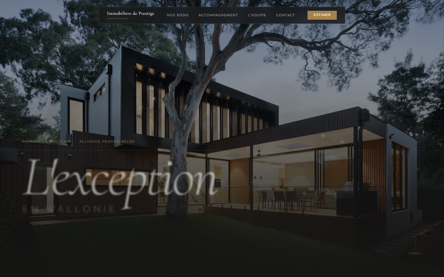

What separates these isn't more content or more pages — it's the opposite. The redesign removesthe duplicate sections, fixes the contrast so the argument is actually readable, replaces “Sign up” with a real seller CTA, and adds the social proof (client testimonials, notable sales) that a luxury brand needs and the current site has none of. Restraint costs design time, not extra pages — which is exactly why it sits at the higher end of the range above, not because there's more of it.
Honestly:a bigger budget doesn't automatically buy you a better site. I've seen €8,000 sites with the same low-contrast, generic-template problems as a €2,000 one. What the higher end of the range actually buys, when it's spent well, is a designer who diagnoses what's broken first — same as the free checklist above — instead of just adding more pages.
How to spend whichever budget you have well
- Audit before you redesign. Know exactly which of the 15 conversion points are broken before paying anyone to touch your site — otherwise you're guessing at the brief.
- Fix contrast and copy density first. These cost nothing extra to get right and they're the most common reason a real estate site fails to convert, budget tier aside.
- Spend on restraint, not volume. A luxury or premium brand rarely needs more sections — it needs fewer, better ones.
- Put the seller CTA where it belongs. On most agency sites I've audited, the most profitable action (get a property valued) is the least visible one.
What's next?
Want the full method, not just this article?
“Rebuilding a real estate agency website that converts” walks through this exact method section by section: what to cut, what to add, and in what order, regardless of your budget tier. One-time purchase ($49) on Gumroad, never a subscription.

Hamza Benjaaba
Web designer and no-code developer, specialized in websites for real estate agencies and local service businesses. The before/after shown here comes from a real audit and redesign brief, not a stock mockup.