Design patterns
Three real estate website heroes, three price tiers — the CTA none of them hide
July 30, 2026 · 7 min read
Search “real estate agency homepage examples” and you'll get glossaries defining what a hero section is, and inspiration galleries with dozens of screenshots and zero analysis. Search “estimation CTA visible conversion” and you'll get the same three sentences everywhere: put your button where people look, use an action phrase like “get a free valuation,” make sure it works on mobile. True, and useless — nobody shows you what it actually looks like when a site gets this right, at different price points, for different kinds of real estate businesses.
So here are three hero sections I designed myself, for three different positions in the market — a local mid-market agency, a luxury network, and a property management company. None of these is a live audited client site the way Club Immobilier or Immobilière de Prestige were in earlier pieces; they're concept redesigns from my own portfolio, built to test exactly this problem. I'm saying that upfront because the whole point of this blog is honesty about what's real and what isn't. What is real: the screenshots, and the one design decision all three share.
Free checklist
Grab the checklist before you keep reading
This article is basically chapters 1, 2 and 5 of the method I use on every agency site, condensed into three examples. Get the full 15-point checklist to audit your own home page in 10 minutes, section by section.
The job a real estate hero actually has to do
A real estate homepage serves two people with opposite intents at the same time: someone who wants to browse listings, and someone who wants to know what their own property is worth. I wrote about this fork in an earlier teardown — on Club Immobilier's original site, the “estimate” widget was cropped off the bottom of the screen, competing with two other offers of equal size. That's the failure mode. Here's what the fix looks like when you design for it from the start, at three different budgets.
1. The local agency: search-first, valuation second, trust immediate
Lille Immo positions itself as a straightforward local agency — buy, rent, or get a valuation in the Vieux-Lille neighborhood and around it. The hero doesn't open with a slogan; it opens with a pre-filled, editable sentence: “I want to buy an apartment in the Vieux-Lille neighborhood for under €400,000.”
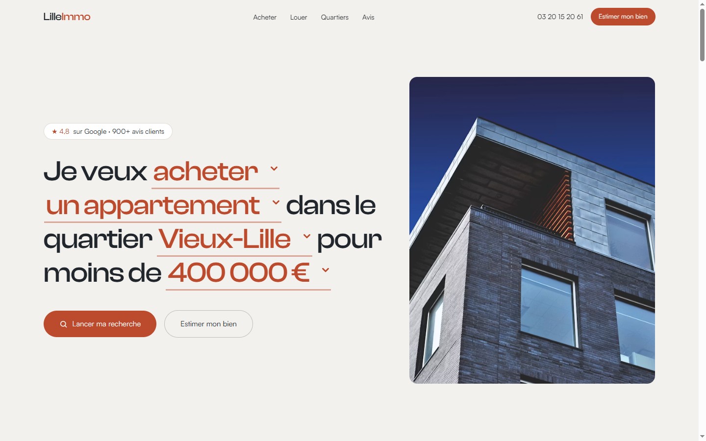
Three things worth copying:
- The search bar does double duty as the value proposition.Instead of a generic “find your next home” headline, the hero states the exact filters (transaction type, property type, neighborhood, budget) as an actual sentence. It reads as useful before it reads as marketing.
- The valuation button never got demoted to a nav link. It sits directly beside the primary search button, same visual row, same button style family — a deliberate two-path structure, not a buyer-only site with an estimate afterthought.
- The trust signal is at the top, not the footer.“4.8 on Google · 900+ reviews” sits above the fold, next to the headline. Compare that to Club Immobilier's original site, where the “40 years” badge was buried in the footer next to a “Copyright 2018,” — the exact opposite instinct.
2. The luxury network: cinematic photography, one always-visible CTA
Maxwell-Baynes is positioned as a luxury network — châteaux, vineyard estates, exceptional villas from Bordeaux to the Arcachon basin, part of the Christie's international network. Nothing about a full-bleed lifestyle photo and a serif wordmark screams “conversion-optimized” at first glance — which is exactly why the CTA placement matters more here, not less.
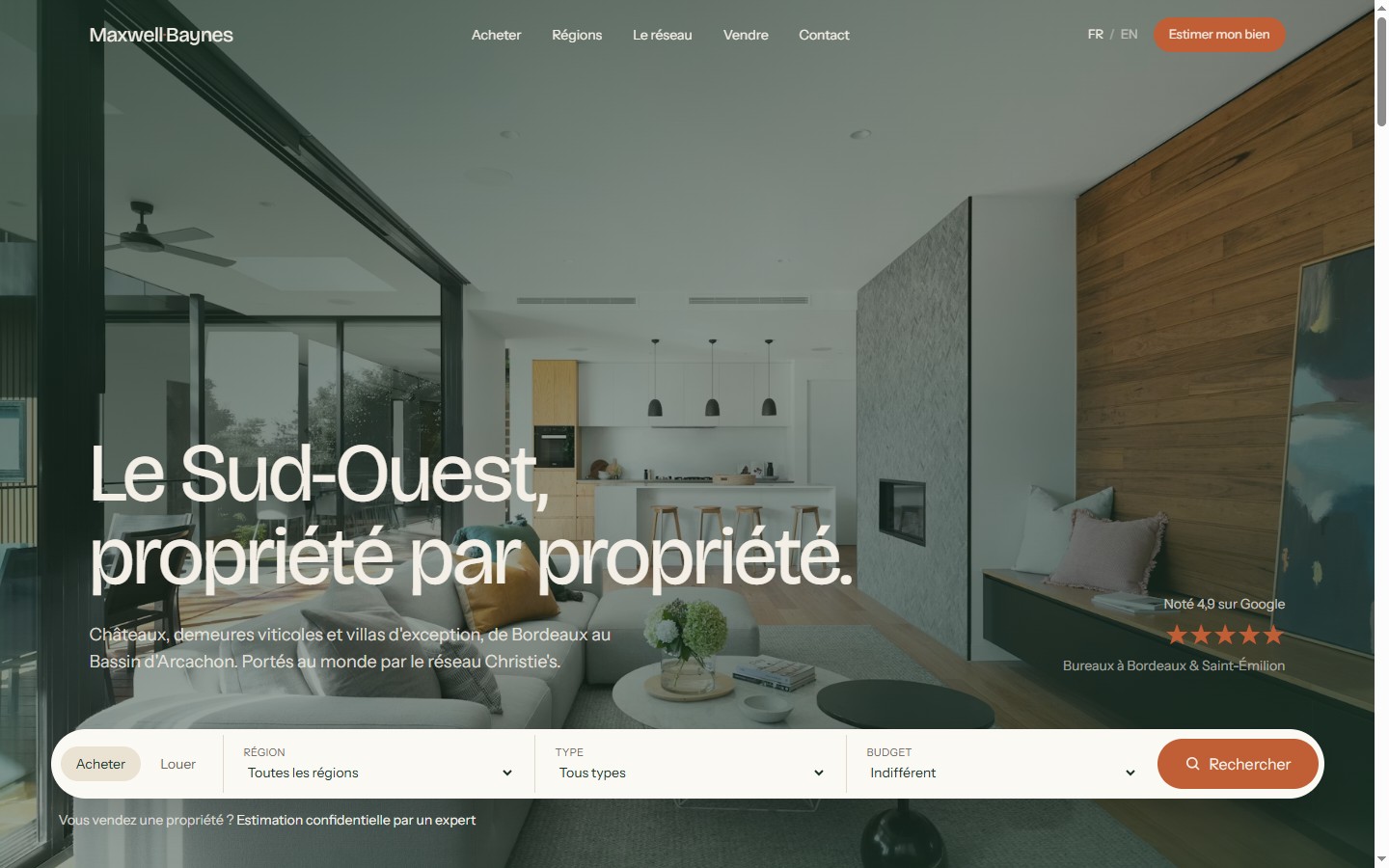
This is the pattern I flagged as missing on Immobilière de Prestige's real site in an earlier piece: their one high-contrast button said “Sign up,” not anything about a valuation, and “Estimations” was a plain-text nav link with no more visual weight than “Résidences secondaires.” Maxwell-Baynes solves the same brief — luxury, restrained, photography-led — while keeping the seller action as the single loudest element in the navigation itself. The rating badge (“Noté 4,9 sur Google,” office locations) sits inside the hero, not scrolled past.
Restraint and a visible CTA aren't in tension. The redesign direction I built for Immobilière de Prestige later in that piece used the same logic: same visual budget, same amount of design work, the only change was which action got the loudest button.
3. Property management: two CTAs, two intents, still no hierarchy confusion
Tours'n Gestion is a different vertical inside the same niche — rental property management for landlords, not a sales agency. Its hero has to serve two intents that are both real, but different from the buyer/seller fork above: manage my rental for me and tell me what it's worth.
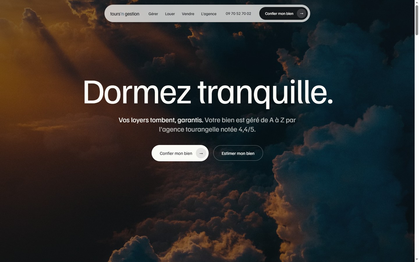
The lesson here isn't “always give the valuation button top billing” — it's that whichever action is your actual product has to be legible in one glance, and the secondary action has to still be there, not cut for the sake of simplicity. “Dormez tranquille” (“sleep easy”) does the promise work in two words; “vos loyers tombent, garantis” states the mechanism; the local rating (“agence tourangelle notée 4,4/5”) does the trust work, all above the fold, all before either button.
What the three have in common
- Lille Immo — buy/sell locally, valuation CTA beside the primary search button, 4.8★ with 900+ reviews above the fold.
- Maxwell-Baynes — buy/sell luxury, valuation CTA in the nav bar (visible at every scroll position), 4.9★ with office locations in the hero.
- Tours'n Gestion— rental management, valuation as a secondary hero button next to the primary “entrust my property” CTA, 4.4/5 local rating above the fold.
What none of the three has: a generic “welcome to our website” headline, a wall of text sitting between the visitor and the CTA, or a single-intent hero that ignores the second audience entirely.
None of these three needed more sections, more copy, or a bigger budget to get this right — they needed the valuation or entrust action treated as a first-class citizen of the hero, not something a visitor has to go looking for. That's chapter 2 of the guide I wrote after auditing Club Immobilier and Immobilière de Prestige, in three different keys.
Honest note on results:I don't have independent conversion data for these three — they're concept work, not sites with live traffic I can report on. What I can say is that the specific failure I'm contrasting them against (a valuation action buried in a nav link or cropped by a layout) is one I've personally found on two real, live agency sites during actual audits — that part isn't speculative.
If you're briefing a redesign
- Decide your hero's two intents before you write a single headline. For a sales agency, it's buyer/seller. For a management company, it might be owner/tenant, or entrust/estimate, like Tours'n Gestion.
- Give the secondary intent a real button, not a nav link. A plain-text link reads as optional. A button reads as a real path.
- Put your strongest trust number above the fold. A Google rating buried in the footer does nothing for the 90% of visitors who never scroll that far.
- Don't confuse restraint with hiding the CTA. The luxury example above proves you can be photography-led and still keep the CTA the loudest element on the page.
Free checklist
Audit your own hero with the full grid
This is 3 of the 15 points in the checklist I use on every agency site. Get all 15 and go through your own home page in 10 minutes.
Want the complete method, not just the hero?“Rebuilding a real estate agency website that converts” ($49, one-time purchase on Gumroad) covers this and seven other chapters, from the first 3-second test to a launch-week checklist.

Hamza Benjaaba
Web designer and no-code developer, specialized in websites for real estate agencies and local service businesses. The three redesigns shown here are my own concept work, built to explore this exact hero pattern at three different price points — not stock templates. I audit every real client site with the same 15-point grid, console open, before I touch a single pixel.