Listings
Real estate listing cards: the page that sells a picture, not a spreadsheet
August 3, 2026 · 7 min read
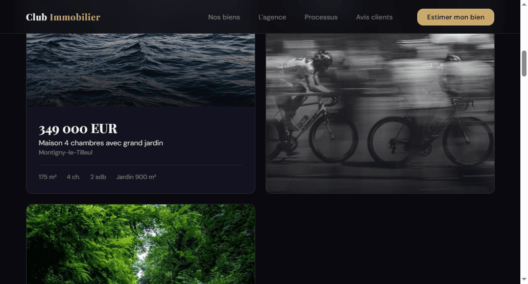
Every real estate agency site has a listings page. Almost none of them treat it like the actual sales floor it is.
I audited Club Immobilier, a 40-year-old Belgian agency, section by section — hero, listings, about, testimonials, footer. The listings page is where I found the single worst screen on the entire site. Not the ugliest. The worst, because of what it does to someone who is actively trying to buy something from this agency.
Free checklist
Grab the checklist first
This is one point out of 15 in the grid I use on every agency. Get the full checklist to audit your own listings page — and 14 other conversion leaks — in 10 minutes.
The screen that greets a buyer who filters too precisely
Here's what a visitor actually sees when they apply filters that don't happen to match a live listing:
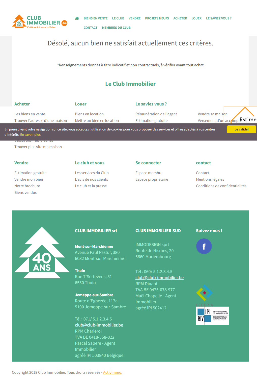
That's it. No suggestion to widen the search. No nearby listings. No “notify me when a match appears.” Just a full-page dead end, immediately followed by a footer stamped “Copyright 2018” — so the one visitor who narrowed their search enough to actually want thisagency's inventory gets told, in the same screen, that nobody here is that specific and nobody has touched this site in years.
This is the failure mode that matters most: an empty state isn't a bug, it's a design decision nobody made on purpose.Whoever built this page handled the case where listings exist. Nobody handled the case where they don't — and on a real, live agency site, that case comes up constantly, because most buyers filter by budget and bedroom count before they filter by anything else.
Above the empty-state screen, the same page has a second, quieter problem: even when a search does return results, the cards themselves are small, price-first-in- tiny-type, image-second. A thumbnail asks a buyer to imagine the property. It doesn't show them one.
Why a card is not a row, and a row is not a sale
A spreadsheet row optimizes for comparison: same font size for every field, price and square meters carrying equal visual weight. That's the right format for an internal CRM. It's the wrong format for a homepage, because a buyer browsing listings isn't comparing rows — they're trying to fall for a place.
The fix I used on the rebuild treats every listing the way a real estate photographer treats a hero shot: the photo is the argument, and everything else is a caption.
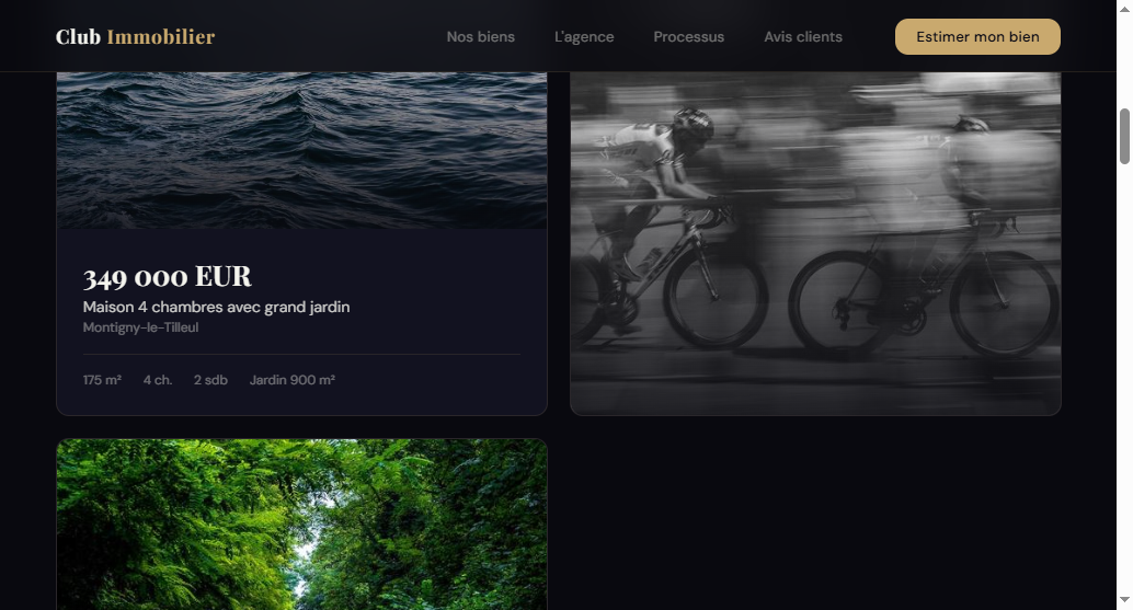
Full-bleed photo first. Price in a display font, large enough to read at a glance — not squeezed into the same 12px as the address. Four specs, no more: size, bedrooms, bathrooms, garden.
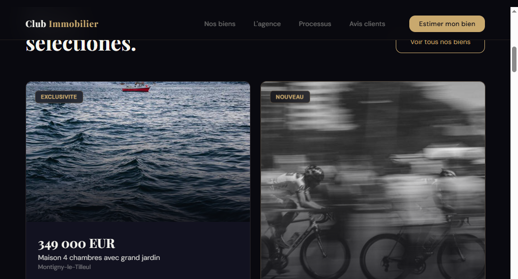
The badges do one job: create a reason to look now instead of later. Used on every card, they'd cancel each other out — reserved for a couple of listings per page, they read as genuinely exclusive.
The empty state, rebuilt
The card layout doesn't solve the empty-state problem by itself — that needs its own decision. On this rebuild, a zero-result search stops being a dead end and becomes a second chance: nearby listings that relax one filter at a time (same city, wider budget) instead of a blank page, plus a one-line offer to get notified when a new match appears. A visitor who took the time to filter this precisely is close to a lead, not far from one — the page should treat them that way.
The four rules that make or break a listing card
- Photo first, always. Full-bleed, not thumbnail-sized. A buyer decides whether to click in under a second, and that decision is made on the image, not the address line.
- Price gets its own visual weight. Display font, not the same size as the square-meter count next to it. Price is the number every buyer scans for first — design it like one.
- Cap the specs at three or four.Bedrooms, size, location, maybe bathrooms. Every extra field on the card competes with the photo for attention and adds nothing a buyer can't ask about later.
- Design the empty state on purpose.A zero-result screen is not an edge case on a real estate site — it's a routine outcome of normal filtering. Treat it as a page, not an accident: offer nearby matches or a notify-me option instead of a dead end.
Honest note on results:I haven't found independent, third-party data proving a specific conversion lift from card redesign alone — the “+18% conversion” figure sometimes attributed to interactive-map studies is a vendor-reported number I haven't verified myself, and I'm not repeating it as fact. What I can say directly: a full-page “no results” message with zero next step, sitting right above a 2018 copyright date, is a real, verified screen from a real agency site — and it is objectively a worse experience than one offering even a single alternative action. Fixing that isn't a guess; leaving it unfixed is the actual risk.
If you only fix one thing this week
Go to your own listings page and apply filters specific enough to return nothing — a narrow price range, an uncommon bedroom count. If the result is a blank screen with no next step, that's a worse leak than your card design. Fix the dead end before you touch photography or layout.
Free checklist
Audit the rest of your listings page
This is one point out of 15. Get the full checklist — the same grid I used on this audit — and go through your entire home page in about 10 minutes, not just the listings section.
Want the complete method, not just this one fix?The guide “Rebuilding a real estate agency website that converts” ($49, one-time purchase on Gumroad) covers listing cards as its own chapter, plus seven others — from the first 3-second test to a launch-week checklist.

Hamza Benjaaba
Web designer and no-code developer, specialized in websites for real estate agencies and local service businesses. The redesign shown here is my own rebuild of Club Immobilier's actual site, not a stock template. I check what a real search with zero results actually shows before I redesign a single card — because a catalog page that only works when it's full isn't finished.