Identity
What ‘premium’ actually means on a real estate website: three identity tells I keep finding
August 10, 2026 · 8 min read

Every agency I've audited that told me its site “looks cheap” assumed the cause was money. It almost never is. On the two live agency sites I've torn down in detail, the identity problems had nothing to do with budget and everything to do with the absence of a rule — decisions taken one section at a time, by different people, at different moments, with nobody deciding what the site was allowed to look like.
That's the useful reframe: premium is not a spending tier, it's a set of constraints. A site reads as expensive when a small number of decisions are applied without exception. It reads as cheap when every section got its own decision.
Here are the three tells I keep finding, taken from two agency sites I audited and rebuilt, plus the four-line spec I'd hand a designer to prevent all three.
Free checklist
Grab the checklist first
Identity is one part of the 15-point grid I use on every agency site. Get the full checklist and go through your own home page — hero to footer — in about 10 minutes.
First, an order-of-operations warning
I've written before that identity is not the first thing to fix. If your valuation CTA is buried in a nav link, or your listings page returns a dead end, colour palettes are the wrong argument to be having. Close the conversion leaks first.
But identity is also the line clients pay the most for and specify the least. “Modern,” “premium,” “high-end” appear in almost every brief I read, and none of those words tells a designer anything actionable. So this article is about the step after the leaks: what those words have to become before anyone can build against them.
Tell 1 — Colours stacked instead of ranked
Club Immobilier is a Belgian agency that has been trading since 1986. Its original home page was a stack of colour blocks — green, orange, wood tones — sitting one after another with no hierarchy between them.
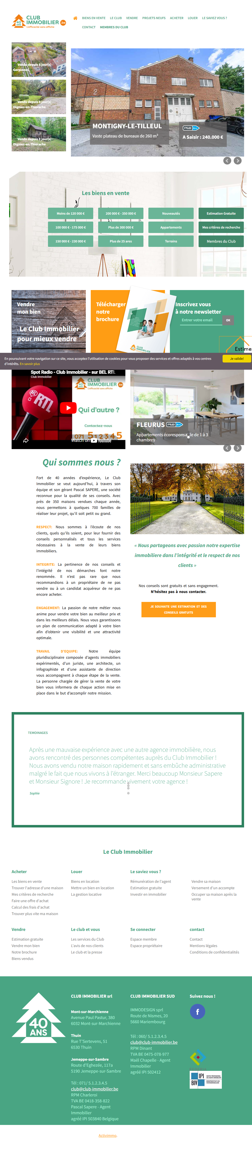
Look at what that does. Nothing on the page is theimportant thing, because everything is equally loud. The agency's actual asset — a “40 YEARS” badge next to the logo — was shrunk to stamp size in the top-left corner, while a “Radio Spot” YouTube embed took a full band of the page. That isn't a taste problem. It's a ranking problem expressed in colour.
The rule I apply, and the one in chapter 6 of my guide, is deliberately narrow: two or three colours, plus one accent, and the accent has exactly one job. On the Club Immobilier rebuild, that resolved to deep charcoal, white, and champagne gold — with gold reserved for the action I wanted a seller to take, and used nowhere else.
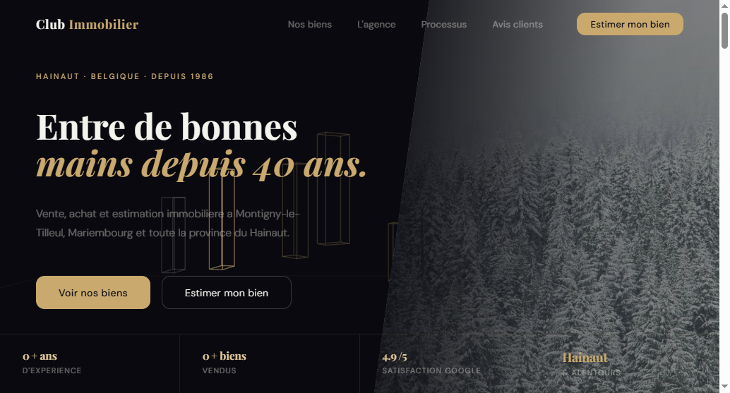
Nothing in that redesign is more expensive to build than what it replaced. A charcoal background costs the same as a green one. What it cost was a decision made once and then defended across every section.
The check you can run today: open your home page and count how many colours are doing a job— not how many exist, how many carry meaning. Then find your accent colour and count how many different things wear it. If your accent appears on a decorative divider, a section background, and a button, it has stopped being an accent. It's just another colour, and your primary action no longer has anywhere to stand out.
Free checklist
Can you name your site's accent colour and its one job?
If you can't answer that in one sentence, your accent colour isn't doing its job. Get the checklist and audit the rest of your identity in the same 10 minutes.
Tell 2 — Contrast lowered on purpose, mistaken for restraint
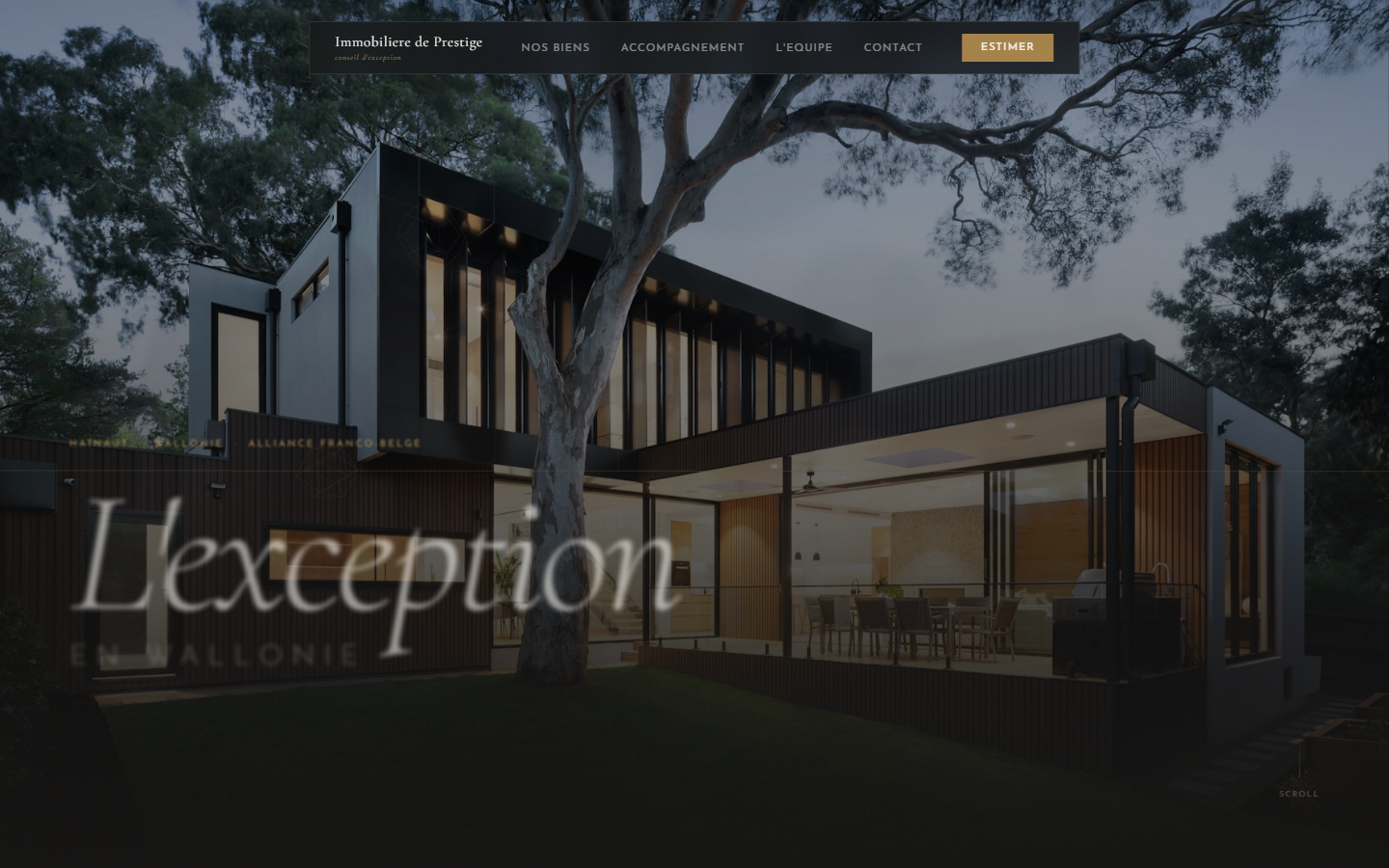
The second site is Immobilière de Prestige, a luxury agency in Belgium selling villas and exceptional properties. This one matters more than the first, because its site is not a cheap template. It has real cinematic photography, an integrated property search, real agent photos. Somebody spent real money on it.

And further down, the sentence that's supposed to explain why you'd trust them with an exceptional property is set in pale grey on near-white. It's barely legible. I'm not going to quote a measured contrast ratio, because I didn't measure it — what my audit recorded is what anyone recognises on screen: you have to work to read it.
This is the tell I find hardest to argue clients out of, because low contrast feelsupmarket. Luxury brands use restraint, so faint type must be restraint. It isn't. Restraint is about how many elements are on the page, not about how visible the surviving ones are. A luxury print ad has one headline — set in ink black, at full strength. Nobody makes the one sentence they kept hard to read.
And contrast is the one part of this whole article that isn't a matter of taste: text legibility has a published, objective standard (WCAG), which means it's also the only identity decision where “I prefer it lighter” is not a valid position. It's simultaneously an accessibility failure and a conversion failure — the argument doesn't get read, so the argument doesn't work.

The redesign direction above is objectively morerestrained than the current site — fewer sections, fewer colours, less copy — and every word on it is at full strength.
Tell 3 — One template, filled in twice
This is the tell almost nobody names, and it's the one that quietly signals “assembled” rather than “designed.”
On the same Prestige site, two nearly identical “workflow” sections sit on the same page, serving two different purposes, using the same 01/02/03 numbered layout. On top of that, the section carries the English label “WORK FLOW” on an otherwise French luxury site.
Neither of those is a catastrophe on its own. Together they tell you something specific about how the site was made: a template was chosen, then filled in twice because it was there, and nobody read the finished page end to end before it went live. That's the actual failure — not the duplicate, but the absent final read.
Visitors don't consciously register “that's the same module twice.” They register a vaguer thing: this page repeats itself, so it probably wasn't made for me. For a luxury agency, whose entire promise is bespoke handling, that's an expensive impression to leave.
The rule:if two sections on a page share a template, one of two things has to happen — merge them into one, or genuinely differentiate them. Leaving them as accidental twins is never the right answer. And a stray language label is worth chasing down not because one English word matters, but because it's proof that nobody proofread the page in sequence. Where there's one, there are usually three.
The part that isn't about colour: typography
Type is where “premium” is won or lost fastest, and the rule is short enough to fit in a brief line: one display or serif face for headlines, one clean sans-serif for body text, and no third family without a reason you can say out loud.
Serif headlines do authority and heritage work — exactly the register a 40-year-old agency or a luxury network needs. A clean sans does readability work for everything a visitor actually has to process: specs, prices, form labels, legal mentions. On the Club Immobilier rebuild that was Playfair Display over Inter, nothing more exotic.

Same section content as the original wall of text about the agency's values. What changed is that the hierarchy now tells you what to read first, and the type does that work rather than four competing colours.
The four-line identity spec
If you take one thing from this article into a brief or a quote, take these four sentences. They're short on purpose — a provider quotes what's written down, and vague adjectives get quoted as whatever's cheapest.
- “The site uses two or three base colours plus a single accent. The accent colour is used only for the primary action, nowhere else.”This one line prevents the entire first tell, and it's checkable at delivery in about ten seconds.
- “All body text meets published contrast standards against its background. No decorative light-grey type on light backgrounds.” Objective, testable, and not open to negotiation on taste grounds.
- “No two sections on the same page use the same layout template. If two are similar, they are merged or explicitly differentiated.” Turns an invisible flaw into an acceptance criterion.
- “Two type families maximum: one for headlines, one for body. Any third family must be justified in writing.”Written justification is the point — it doesn't ban the exception, it just makes it deliberate.
These four lines pair with the eight real-estate-specific lines I published in my piece on writing a website brief and scoring the quotes you get back. Together they cover the two halves of the same problem: what the site has to do, and what it's allowed to look like.
Honest note on results:I have no conversion data isolating the impact of an identity change on its own, and I'm not going to invent a percentage for it. Nobody handed me before-and-after analytics on these two sites, and any figure I quoted would be a guess dressed as evidence. What I can state directly, from audits I ran myself: the colour stack, the pale-grey body text, and the duplicated template are real, documented, and were all sitting on live agency sites — one of them a luxury site that cost real money. Of the three, only the contrast one has an objective standard behind it. The other two I argue on craft, and you're entitled to disagree.
If you only fix one thing this week
Screenshot your home page, then desaturate it — any image editor, any phone photo editor, remove the colour entirely.
Now look at what still stands out. In grayscale, colour can't do your hierarchy for you, so what remains is the actual structure: size, weight, spacing, contrast. If nothing is clearly the loudest element, you don't have a colour problem you can fix with a new palette — you have a ranking problem, and a new palette will reproduce it in different colours.
If the loudest element turns out to be something that isn't your valuation CTA, you've just found something more expensive than an identity issue.
Free checklist
Audit your whole home page, not just the palette
Identity is one part of the 15-point grid I use on every agency site — hero, listings, social proof, valuation form, footer, console. Get the full checklist and run it on your own site in about 10 minutes.
Want the full method rather than one chapter of it?“Rebuilding a real estate agency website that converts” is the eight-chapter guide behind this article — the 3-second test, the buyer/seller fork, social proof placement, listing cards, the valuation form, identity, technical hygiene, and a launch-week checklist. One-time purchase, $49, on Gumroad — never a subscription.

Hamza Benjaaba
Web designer and no-code developer, specialized in websites for real estate agencies and local service businesses in France and Belgium. Both sites in this article are ones I audited myself and then rebuilt: the colour stack, the stamp-sized “40 years” badge, the pale-grey body copy and the duplicated “01/02/03” template are things I found on live pages, not illustrations I invented for the argument. The “after” screenshots are my own redesign work.