Trust signals
Real estate website social proof: it's not about having testimonials, it's about where they sit
August 6, 2026 · 7 min read
Most agency websites I audit already have social proof. A testimonial page exists. A “years in business” number is written down somewhere. Nobody starts from zero. And yet almost none of that proof actually moves a visitor toward a valuation request — because having it and placing it are two different jobs, and only one of them gets done.
Club Immobilier, the 40-year-old Belgian agency I tore down in an earlier piece, is the clearest example I've audited of this exact gap.
Free checklist
Grab the checklist first
Trust signals are one point out of 15 in the grid I use on every agency. Get the full 15-point checklist to audit your own site's social proof — and 14 other leaks — in 10 minutes.
A strong testimonial, sabotaged by a heading
Buried near the bottom of Club Immobilier's actual home page sat a real client testimonial: “sold our house quickly… even though we live abroad.”That's a genuinely good quote — it speaks directly to the exact fear a seller has (an agency that won't hustle for an absent owner) and answers it in one sentence.
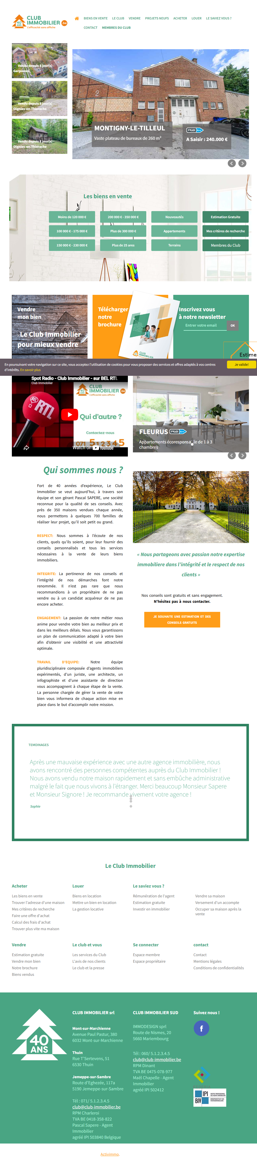
Here's what that quote was actually wrapped in: plain text, no client photo, no star rating, sitting under an all-caps heading that read “TESTIMONALS” — no accent, and a spelling mistake on the one word whose entire job is to signal “we take reviews seriously.” A misspelled word next to a piece of trust content does outsized damage: if nobody proofread the heading above a review, why would a visitor believe anyone vetted the review itself, or would follow through on their own file with the same care?
That's the first failure mode, and it's the one worth naming clearly: the proof existed. Nothing about it read as proof.
The second failure mode: the best number, in the least-seen place
Separately from the testimonial, Club Immobilier had one more trust asset — arguably its strongest: a “40 YEARS” badge, next to the logo. Forty years in one town is not a small claim. It's the kind of number a newer competitor cannot simply copy.
That badge lived in the footer, directly above a line that read “Copyright 2018.”
Put the two facts next to each other and the problem is obvious: the agency's number-one argument sat exactly where visitors stop scrolling before they leave, signed with a date that reads “nobody has touched this site in years.” A stat that could have opened the page instead closed it, quietly, where almost nobody was still looking.
What moving proof, instead of just having it, actually looks like
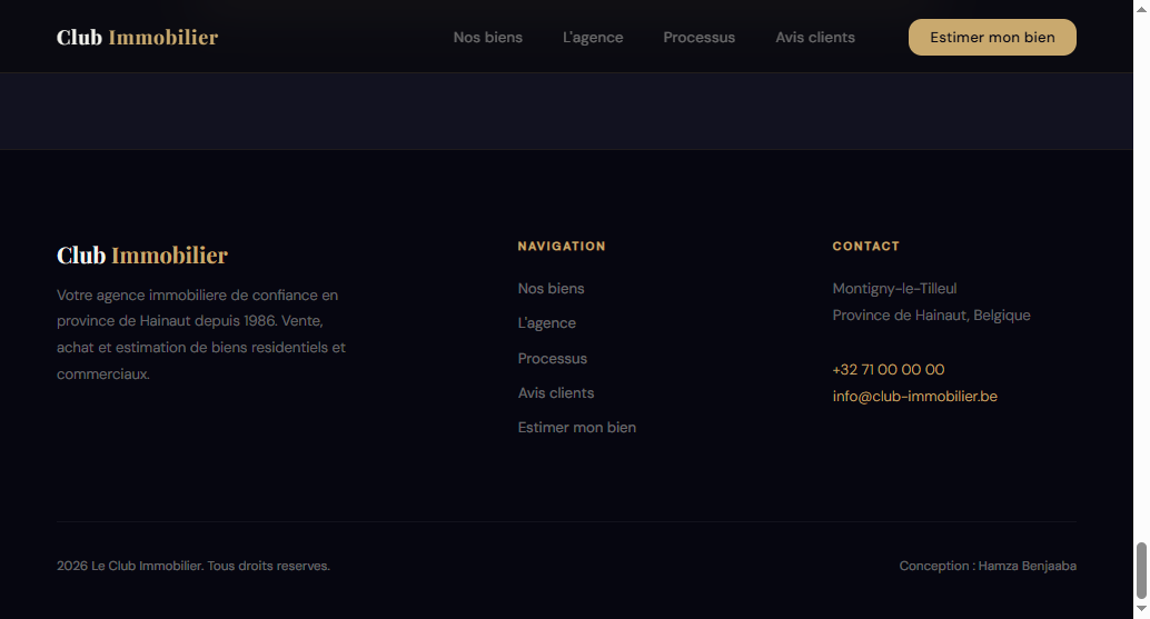
The fix for both problems wasn't collecting new social proof — Club Immobilier didn't need a single new review or a bigger number. It needed the proof it already had moved to where a visitor's eyes actually land, and built as a real component instead of an afterthought.

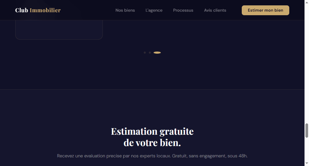
The “40 years” badge didn't get removed from the footer — it moved to a stats bar directly under the hero headline, next to properties sold and the agency's Google rating, animated so it earns a second look instead of blending into the page furniture. Same fact, same number, an entirely different amount of work being done by it.
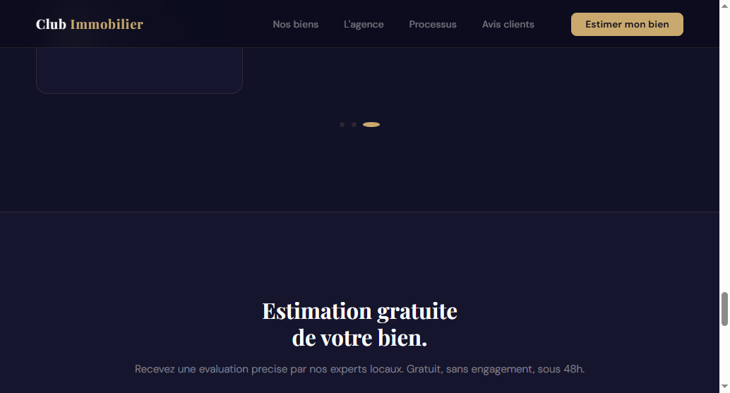
Sophie's quote didn't change either. What changed is that it now sits in a carousel component built to hold a face, a name, and a star rating — staged the way a recommendation looks, instead of typed the way an afterthought looks.
The pattern isn't unique to Club Immobilier
Compare that to Maxwell-Baynes, a luxury real estate concept redesign I covered in an earlier piece on hero sections. Its trust signal — a “Noté 4,9 sur Google” rating badge — sits directly inside the navigation of the hero itself, not scrolled past, not filed away on a separate page.
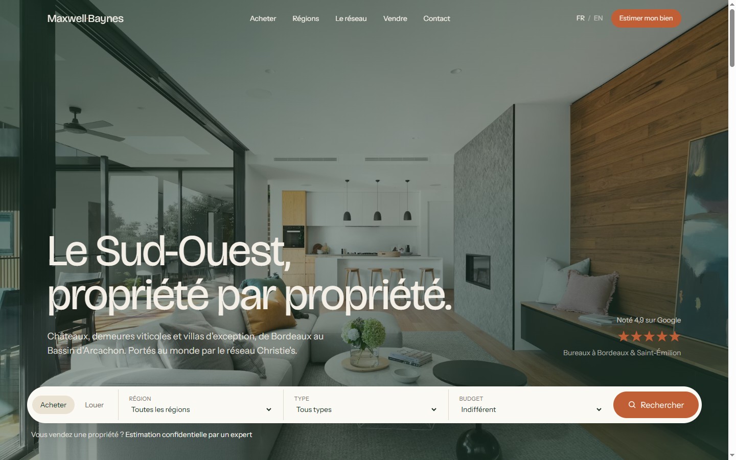
Nothing about that placement required more design work than putting the same badge in a footer would have. The only difference is a decision about where the eye already goes, made on purpose instead of by default.
Four rules for where social proof actually belongs
- Move your single strongest trust number into a stats bar directly under the hero. Years in business, properties sold, review score — whichever one is hardest for a competitor to copy — animated on scroll so it earns a second look, not filed at the bottom of the page where scroll depth drops off.
- Style testimonials as a real component, not a paragraph. A photo or initials, a star rating, a short quote. The exact same words, typed as plain text under a generic heading, read as an afterthought regardless of how good the quote is.
- Audit every heading that sits next to a trust signal for typos, specifically.A misspelled word anywhere else on a site is a minor flaw. Next to the section meant to build trust, it's a signal that undercuts the very thing it's introducing.
- Never let your best proof live only in the footer.If the strongest thing you can say about your agency only appears after a visitor has already decided whether to stay, it isn't doing conversion work — it's an archive.
Honest note on results:I don't have independent, third-party data isolating the lift from repositioning existing social proof alone — most of what circulates online on this topic (carousel click-through rates, specific conversion percentages tied to review placement) comes from marketing-tool vendors, not verified studies, and I'm not going to repeat those numbers as if I'd tested them myself. What I can say directly from this audit: the testimonial and the “40 years” badge were real, true, and already earned — they simply weren't placed or styled to do anything. Moving proof you already have costs nothing to produce and is one of the lowest-risk fixes on a site.
If you only fix one thing this week
Find the single most impressive true thing about your agency — a number, a review, a badge — and time how far a visitor has to scroll to see it. If the answer is “all the way to the footer,” or if it's sitting in plain text under a heading nobody has proofread since it was written, that's the fix to make before touching anything else on the page.
Free checklist
Audit the rest of your site with the full grid
This is one point out of 15. Get the full checklist — the same one I used to audit Club Immobilier — and check your entire home page, not just your testimonials section, in about 10 minutes.
Want the complete method, not just this one fix?The guide “Rebuilding a real estate agency website that converts” ($49, one-time purchase on Gumroad) covers this as its own chapter, alongside seven others — from the first 3-second test to a launch-week checklist.

Hamza Benjaaba
Web designer and no-code developer, specialized in websites for real estate agencies and local service businesses. The redesign shown here is my own audit and rebuild of Club Immobilier, not a stock example — the testimonial and the “40 years” badge are real assets that existed before I touched a single pixel; only their placement changed.