Teardown
I tore down a real estate agency's website — here's why it was losing sellers
July 24, 2026 · 9 min read
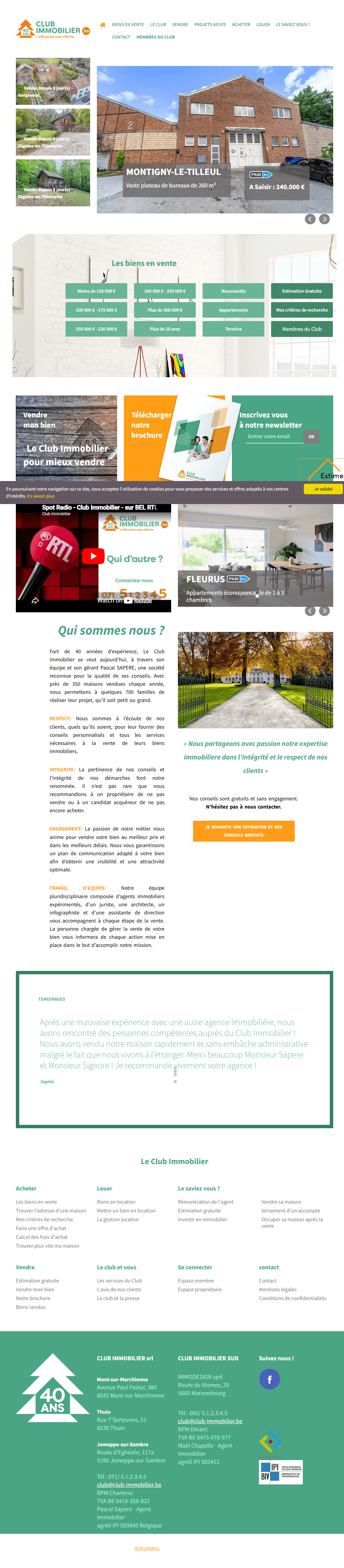
A real estate agency with 40 years of experience in Montigny-le-Tilleul, in the Hainaut province of Belgium. Several physical offices, an IPI-licensed agent, dozens of families helped every year. On paper, one of the strongest agencies in its area.
On its website, a visitor who doesn't know them yet reads exactly one thing at the bottom of the page: “Copyright 2018.” And they ask themselves the question that kills a sale before the first call: if nobody is taking care of this website, is anyone really going to take care of my property?
I spent about twenty minutes tearing this site apart — console open, slow scroll, every section noted — then I rebuilt it. This article is the full teardown: exactly what's broken (with real screenshots), why it drives sellers away, and what a real estate agency website redesign aimed at the opposite looks like.
If your site dates from the same era, read the rest as a mirror. There's a good chance you have at least three of the six leaks I'm about to show.
Free checklist
Grab the checklist before you keep reading
I audited this site with a 15-point grid — the same one I use on every agency. Get it to audit your own home page in 10 minutes, section by section.
The context: a real agency, a website stuck in 2012
Let's be clear right away, because it's the heart of the problem: the agency is excellent, the website doesn't say so.The gap between the real value and what the site communicates is enormous. That's good news: it means all the potential is already there, it just needs a visual translation.
What I notice in 3 seconds, before even analyzing anything: a stack of color blocks (green, orange, wood) with no hierarchy, no sentence telling me why them, and a “Radio Spot” YouTube video that kills the mood outright. The “CLUB IMMOBILIER” logo does carry a strong signal — a “40 YEARS” badge and the tagline “Efficiency without billboards”— but it's shrunk to stamp-size in the top left corner.
My overall diagnosis, section by section, fit into eight red lines: dated design, chaotic hierarchy, invisible CTAs, zero social proof above the fold, zero motion, and — on the technical side — 3 JavaScript errors in the console right on the home page. Nothing unfixable. But each one costs a lead.
The teardown, section by section (before / after)
1. The hero: a property for sale, not a promise
At the top of the page, no headline, no value proposition. Just a slider pushing one listing(“Spacious 260 m² office space — Grab it: €240,000”) and a grid of green price-filter buttons. Below that, three panels compete for attention: Sell my property, Download our brochure, Subscribe to our newsletter— topped by a cookie banner whose “Learn more” link points to… Wikipedia.

What's broken: no promise above the fold. The visitor knows neither who you are, nor why you, nor what to do. What changes in the redesign: a hero that speaks to the seller, with a headline and a clear two-path structure.
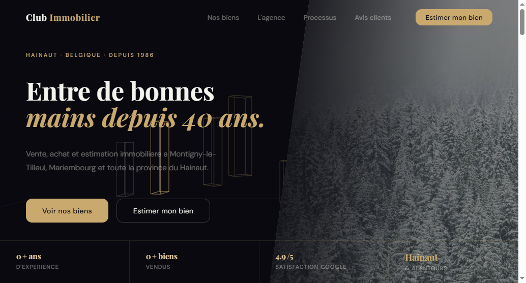
Here: a breadcrumb “HAINAUT · BELGIUM · SINCE 1986”, a Playfair Display headline “In good hands for 40 years”, a line that anchors the area (Montigny-le-Tilleul, Mariembourg, Hainaut province), and only two buttons: See our listings (buyer) and Get my property valued (seller). At the bottom, a stats bar — years of experience, properties sold, Google satisfaction — with counters that animate on scroll. Why it converts better: in 3 seconds, both buyer and seller know exactly where to click, and the proof of longevity is no longer hidden.
2. The listings: from postage-stamp thumbnails to cards that sell the dream
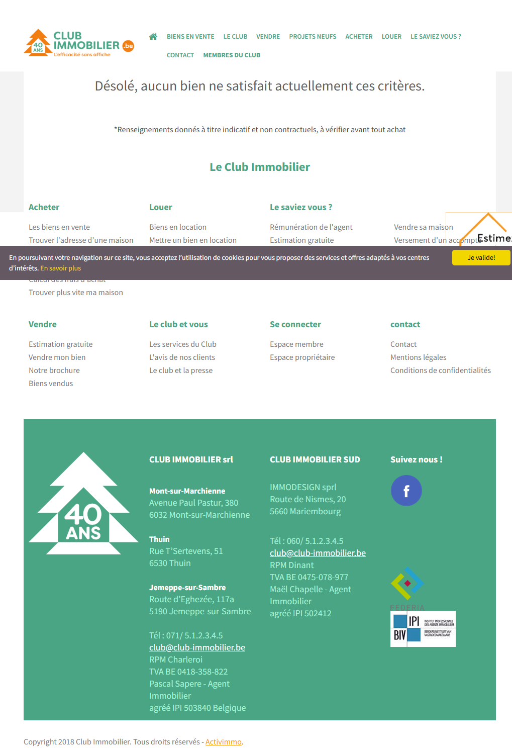
The current listings grid is tiny thumbnails. Worse: depending on the filters, the site displays, big and front and center, “Sorry, no property matches these criteria.” — the most discouraging message a real estate site can possibly show.
What changes: large editorial cards, price front and center, specs readable at a glance.
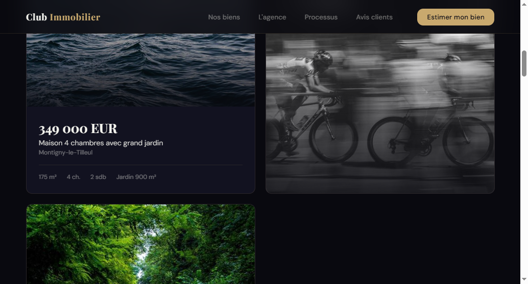
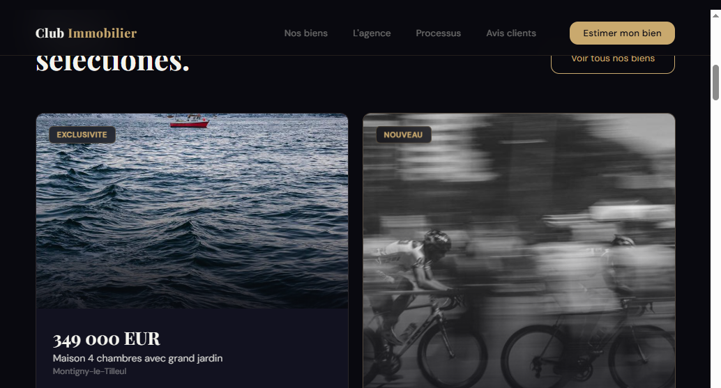
Why it converts better:you're not selling a list, you're selling a mental picture. A card with room to breathe gets a click; a 2018-style thumbnail gets the tab closed.
3. “About us”: 40 years buried in a wall of text
The identity section exists. The problem is it's unreadable: a dense block listing the values RESPECT / INTEGRITY / COMMITMENT / TEAMWORK in tight paragraphs, with not a single face. In real estate, people entrust a lifetime asset to other people — no team photo means trust left on the table.

Why it converts better: people skim a site diagonally. Four chips stick; a paragraph gets skipped.
4. Testimonials: social proof sabotaged by a typo
The reviews section exists too — and Sophie's testimonial is strong (“sold our house quickly… even though we live abroad”). But it's shown as plain text, no photo, no stars, under an all-caps heading with no accents and a typo (“TESTIMONALS”). One spelling mistake on that exact word is the small detail that makes you doubt everything else.
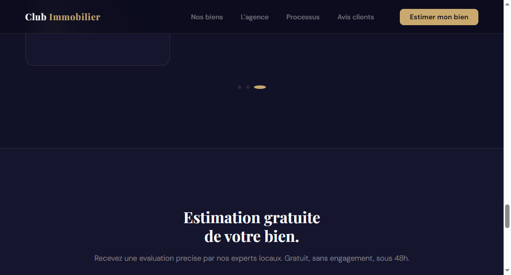
Why it converts better: a staged review reads like a recommendation; plain text reads like an alibi.
5. The footer: the best proof, in the least-seen spot
This is the detail that struck me most. The agency's biggest piece of social proof — the “40 YEARS” badge — is relegated all the way down, in a green footer, right above a “Copyright 2018.”In other words: the number-one argument sits exactly where nobody looks, signed with a date that screams “abandoned site.”
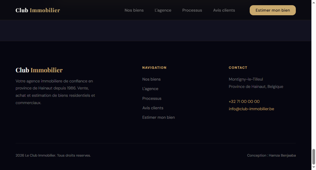
Why it converts better: an outdated footer undoes all the work done at the top of the page. A current date is the minimum signal that someone is actually behind the wheel.
What the redesign really changes
Beyond individual sections, the redesign rests on three foundational decisions.
An identity that says “premium and local.” No more generic green-and-orange: deep charcoal + champagne gold + white, headlines in Playfair Display (authority, upscale feel), body text in Inter (readability). The mood: a 40-year-old Belgian agency, human and serious.
A journey that splits from the very first second. Two buttons in the hero — See our listings / Get my property valued — send buyers and sellers each down their own path. Key numbers count up right under the hero instead of rotting in the footer.
A valuation form that becomes the heart of the site, not a footnote.That's the real leverage point: people want to know what their home is worth.
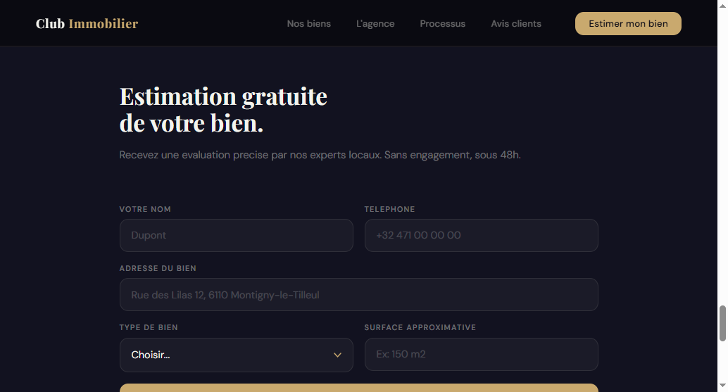
Name, phone, property address, type, size — five fields, a concrete turnaround promise, one button that stands out. That's where traffic turns into a qualified seller lead.
Honesty about results: the targets I aim for with this kind of redesign — roughly a -40% bounce rate, 3x more valuation requests, and a 4-6% visitor-to-contact conversion rate— are goals, not guaranteed outcomes. A website doesn't work miracles; it just stops sabotaging an agency that is already good.
6 quick wins you can do tomorrow (without a full redesign)
Not everyone is ready to rebuild their site this week. Here's what I'd fix tomorrow, even on the current site:
- Add a real H1 above the fold with your promise (who / where / for whom).
- Pull the “Get my property valued” CTA into a dominant position, in a contrasting color.
- Move “40 years” + your Google reviews right under the hero, not in the footer.
- Fix the JavaScript console errors (real SEO and performance impact).
- Update the copyright: 2018 → today.
- Fix the testimonials heading typo (“TESTIMONALS” → “TESTIMONIALS”).
These six alone cost almost nothing and already close several leaks. The full redesign — new identity, 3D hero, motion, counters, frosted-glass cards — is the next level: when you want the site to go on the attack instead of just no longer scaring people off.
Free checklist
Audit your own site with my grid
Did you recognize your home page in at least three of these leaks? Get the 15-point checklist I used for this teardown and put your own site through the wringer in 10 minutes.
Want to go further than the checklist?The complete guide is out — “Rebuilding a real estate agency website that converts” (one-time purchase, $49, on Gumroad) — that walks through the method section by section.

Hamza Benjaaba
Web designer and no-code developer, specialized in websites for real estate agencies and local service businesses. I actually tore down and then rebuilt the Club Immobilier website shown here (the “after” screenshots are my own redesign). I audit every site with a 15-point grid, console open, before writing a single line of design.