Conversion
The property valuation form: the one page most real estate agency websites get wrong
July 27, 2026 · 7 min read
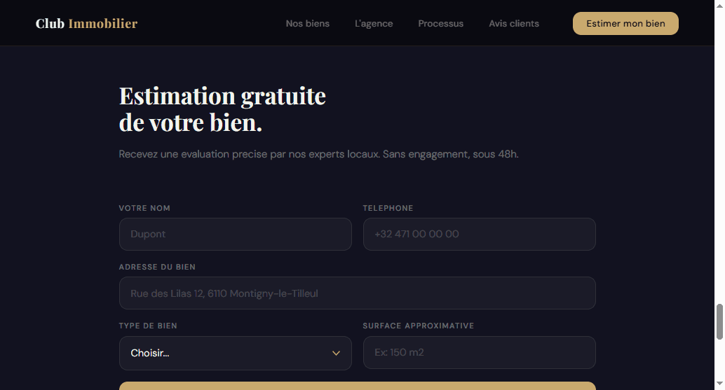
Every real estate agency website has some version of a valuation offer — “estimate my property,” “sell with us,” a form tucked somewhere on the page. Almost none of them treat it like what it actually is: the single page on the entire site that turns a visitor into a mandate.
Listings sell a picture. The “about us” page sells trust. The valuation form is the only one that sells a signature. And yet, across two real agency audits, I've found it treated as an afterthought both times — in two different ways.
Free checklist
Grab the checklist first
This is one point out of 15 in the grid I use on every agency. Get the full 15-point checklist to audit your own site's valuation flow in 10 minutes, not just this one page.
What “having a valuation form” actually means, in practice
Take Immobilière de Prestige, a luxury agency whose site I audited (I covered the contrast and duplicate-section problems in an earlier piece on real estate website pricing). Look at the top of their actual, current home page:
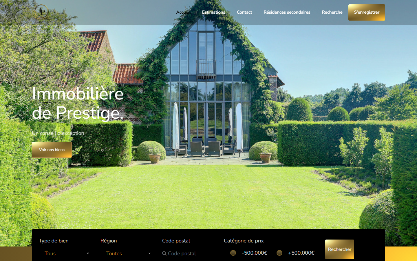
The word “Estimations” is genuinely there. It's not missing. But it's one plain-text link among five, with the same visual weight as “Résidences secondaires.” The only element on the entire screen designed to grab attention — the one gold, high-contrast button — doesn't point at the valuation request. It points at account creation. On a luxury agency site, “sign up” is not a seller's next step; getting a number for their property is.
That's failure mode #1: the form exists, but nothing on the page tells a seller it's the priority.
Club Immobilier, a 40-year-old Belgian agency I tore down and rebuilt in an earlier article, had the opposite-looking but same-root problem:

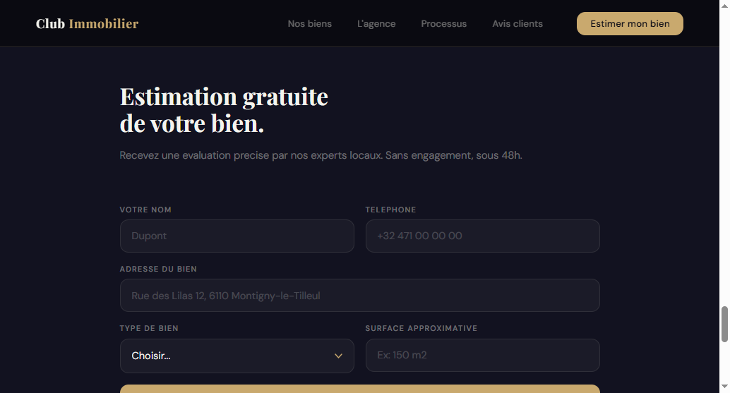
A seller has to notice it, then finish scrolling past the edge of a broken grid to even see the whole thing. Two different agencies, two different symptoms, the same diagnosis: the valuation form is never designed as the product. It's designed as whatever was left over after listings and brand pages were done.
Why this one page deserves more attention than the rest of the home page combined
A listing is worth a commission on a sale that may or may not close. A completed valuation request is a seller actively inviting you to start the sales process with them.It's the closest thing an agency website has to an e-commerce “add to cart” — and yet almost no agency site treats it with e-commerce discipline: a dedicated section, minimal friction, a clear promise of what happens next.
The guide I wrote after these audits (“Rebuilding a real estate agency website that converts”) covers this as its own chapter for exactly this reason — it's the highest-leverage single fix on most agency sites, ahead of redesigning the whole identity.
What actually changes in the form itself
Rebuilding Club Immobilier's valuation section meant treating it as a full-width page section, not a widget:
For Immobilière de Prestige, one of the redesign directions replaced the ambiguous “sign up” pattern with a button that says exactly what it does:

The four things that make or break a valuation form
- Label the CTA for what it does, not for what it is. “Sign up” and “Contact us” describe a mechanism. “Get my property valued” describes an outcome. Sellers click outcomes.
- State a delivery promise.“Free, no commitment, within 48h” converts better than a bare form with no timeline — vague forms read as a black hole, not a service.
- Cap it at five fields.Name, phone, property address, type, size. Every additional field (newsletter opt-ins, “how did you hear about us,” a message box) measurably lowers completion — save that for the phone call that follows.
- Repeat it, don't hide it. Once in the hero, once again after the listings section. A form that only exists in a footer link is a form nobody scrolls far enough to find.
Honest note on results:I don't have independent, third-party data proving a specific lift from this fix alone — the market claims around it (some sources cite 15% form-conversion rates, or a 3x increase in valuation requests from site optimization) are marketing figures from tool vendors, not something I've verified myself. What I can say directly, from these two audits: on both sites, the valuation action was demonstrably the least visible one on the page, competing with or losing to actions that matter far less to the agency's revenue. Fixing that visibility gap is a targeted, low-cost change — not a guarantee of a specific percentage.
If you only fix one thing this week
Open your own site and time yourself: how long does it take to find the button that starts a valuation request, and does it say so in plain words? If you hesitate, or if “Estimations” is a nav link with the same weight as “Contact,” that's the leak — before you touch color palettes, hero photography, or listing card layouts.
Free checklist
Audit the rest of your site with the full grid
This is one point out of 15. Get the full checklist — the same one I used to audit both agencies above — and go through your entire home page, not just the valuation form, in about 10 minutes.
Want the complete method, not just this one fix?The guide “Rebuilding a real estate agency website that converts” ($49, one-time purchase on Gumroad) covers this and seven other chapters, from the first 3-second test to a launch-week checklist.

Hamza Benjaaba
Web designer and no-code developer, specialized in websites for real estate agencies and local service businesses. Both redesigns shown here are my own audits and rebuilds, not stock examples — I open the dev console and time the path to the valuation button before I touch a single pixel.